The Future of E-commerce UX: 5 Essential Consumer Trends Reshaping Online Experiences

The Future of E-commerce UX: 5 Essential Consumer Trends Reshaping Online Experiences


Today’s digital designs for e-commerce websites go beyond just building a homepage with amazing, cutting-edge functionality.

These websites’ designs should strive to provide consumers with more functionality as their likes and preferences change over time. Businesses in the e-commerce sector should be aware that offering their clients a more sophisticated and superior user experience (UX) will help them grow. One method that online shopping sites can increase traffic and capitalize on the rapidly growing popularity of e-commerce is by designing with the user experience in mind.

How Trends in UX Improvement Became Significant in E-Commerce

The majority of e-commerce technologies credit mobile evolution for their sharp increase in usage. This suggests that the markets for mobile apps play a major role in the growth of E-Commerce websites and applications. Online retailers came to understand how important it is to take into account the visitor behaviors on their websites when creating an online buying experience. This led them to hire web developers who can design websites that provide users enormous chances to get reasonably priced goods, coupons, discounts, and deals. These web developers work to enhance user experiences, which includes enhancing the functionality and performance of e-commerce websites. 

Key Trends in UX Enhancements for E-Commerce

Easy and smooth user accessibility is the ideal option for online retailers to satisfy their customers’ ever-increasing and ever-changing expectations. Their mission is to understand that customers find it entertaining when buying sites look more dynamic and imaginative. The ensuing trends in UX enhancements elevate user experiences.  

Based on my recent research, there are five main ways that businesses are using crowdsourced content to improve user experiences.

1. Reviews, on a personal basis

Consumer opinions are nothing new. Personal recommendations had a significant influence on people’s decisions even before the internet. We no longer need to rely on people thanks to the internet revolution. We are able to peruse reviews from hundreds of clients worldwide. This tactic has been employed by entire companies, such as Airbnb, to market their goods. 

Just consider your online purchasing habits: will you accept anything less than a 4-star rating on Amazon? 

Brands are paying more attention to the smaller aspects now that reviews are seen to be on the line. Customers can fine-tune their ratings to those from customer profiles that most closely resemble their own because they are gathering more data than ever before. 

For instance, what if a user wants to know if makeup will suit their skin type and hue well after thirty years of age? This kind of review detail will assist customers in making an informed decision about the things they wish to purchase.
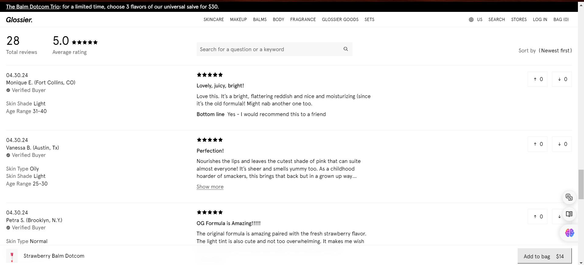
Glossier reviews – includes client skin type, colour and age.

2. Consumer-user-generated content

Additionally, brands are not stopping at content reviews. They’re coming up with a ton of creative ways to include user-generated content on their product pages. Because we are social animals, we have learned to trust the members of our “tribe,” or our circle of friends. When we take strangers to be like-minded people, even their comments have the power to influence us. When you shop at Sephora, you can easily accommodate other consumers in our tribes since they are flexible. 

Users can ask any question they may have to the active online purchasing public on their website. Alternately, decide to assist those shoppers in need. Of course, if you need assistance, you may still reach official Customer Service by clicking here.
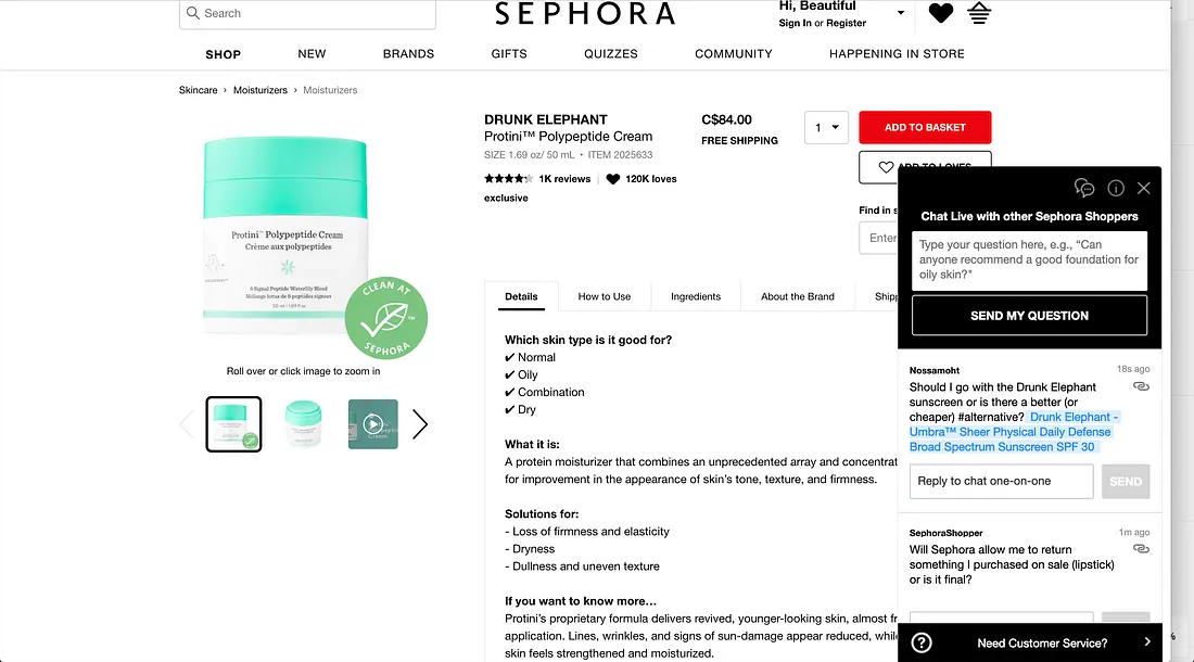
Chat with other shoppers at Sephora

Encouraging customers to interact with one another and giving them the tools to do so makes sense because these tribal recommendations have the potential to be effective drivers of higher customer conversion.

While some firms are adopting a more comprehensive strategy, our chat system concentrates on extremely specific demands. longer form material with actual people narrating their own experiences. An excellent illustration of this is Glossier, where users share their individual beauty routines with an emphasis on how Glossier’s products fit into them. 
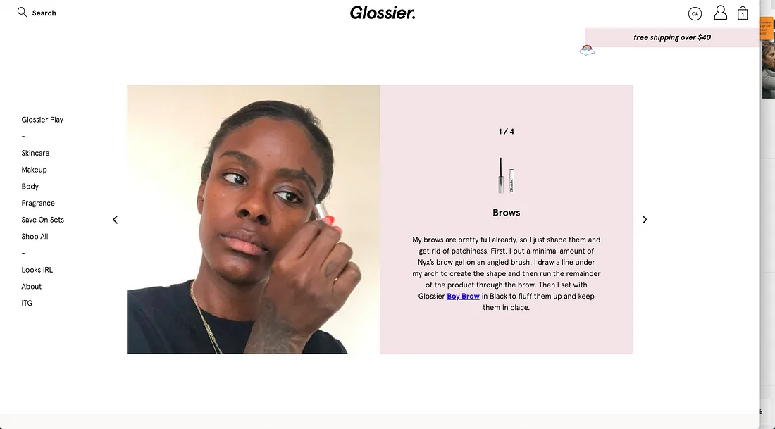
The Glossier community discusses how its products are used in their own workflows.

3. Consumer-Content Captured by the User

Finally, companies are simply not using written material. Instagram crowdsourcing for photography is becoming more and more popular. These platforms are being used by several athletic and athleisure businesses to showcase their products on the bodies of “everyday athletes” such as yourself and me. Wild products, right where they belong. A big cry from the staged setting of the photo studio.
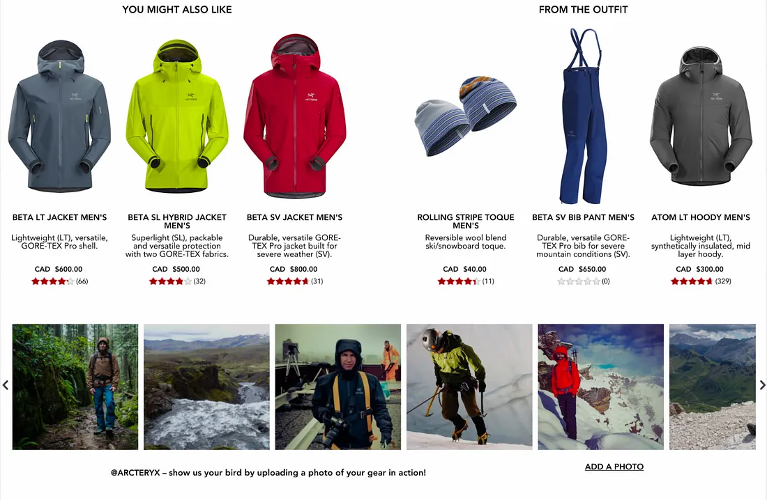
Customers of Arc’teryx displaying their equipment


This social proof not only provides a persuasive push in the direction of a sale for prospective buyers, but it also gives current customers a way to get involved and support the companies they love. The prospect of having your photos appear on the website of a large corporation is exciting. An ingenious hook that entices users to return to the website even when they aren’t interested in purchasing

4. Pays attention to the details

Customers try items on, open pockets, unzip zippers, and press buttons when shopping on the high street. Customers that shop online are limited to the images that your brand chooses to publish. When making decisions, people rely on visual information. They cannot see it if you are not displaying it. Post images that draw attention to the details. Present different perspectives. Draw attention to particular aspects. Give customers a detailed rundown of possible uses for the product.

Detailed Product Image

5. Use content created by users

A lot of consumers favor user-generated photos rather than the staged, commercial shots that companies create. Similar to user-generated evaluations, they are regarded as a more reliable and realistic source of information.

Conclusion

In conclusion, the future of e-commerce UX is defined by five pivotal consumer trends. As digital channels keep growing, prioritization going towards lively and attractive designs and notably perfect usability slowly becomes mandatory. Including human reviews with an emphasis on authentic user-generated content will help build trust and engagement and giving great attention to detail in product output will increase the relevance of communication. While consumer-oriented and always shot with specific consumer preferences, user accessibility remains key and leads to the development of an interface with responsive and intuitive solutions. Utilizing such shifts in trends, the businesses will gain a foothold influence and become a brand of choice for customers looking for top products and services. If you are looking for high quality web or app development services feel free to drop us a message

Unveiling Human Behavior’s Role in UI/UX Design

Unveiling Human Behavior’s Role in UI/UX Design

Complete absorption into the lives of your target audience is necessary to design an empathetic experience. Interviews, personas, use cases, user flows, journey maps, focus groups, and other techniques are used in an educated effort to precisely engage the people you most want to influence, as the UX professional tenet “walk a mile in your customer’s shoes” suggests.

After the 1990s, the notion of creating interfaces for human communication that adhere to certain standards began to take shape. In order to give users a simpler and more intuitive experience, some design concepts were proposed as a consequence of research. A few design tenets have evolved over time in tandem with the shifting demographics. It’s odd that the values we’ve held, developed, and reaffirmed for so long are still so insignificant. What brings us to this state of carelessness? It seems that objective usefulness is not as important as relative beauty.

Understanding Humans Perspective

Many of the components minimize the need of having a thorough understanding of human behavior when applying design thinking. Although it may not be pleasant to hear, your ability to relate to and interact with end users depends more on your comprehension of their requirements, sentiments, and behavior than it does on your technical prowess. It is more about “What will they think and how will the user feel when using this feature” than it is about “I know the perfect features to fix in.” We’ll be analyzing human behavior today and exploring how to strike a balance between the design and human centricities in your thinking to prevent creating a product that will just irritate and eventually scare away customers.

To avoid designing a design that terrifies and dissatisfies users, we’ll examine human behaviors in this essay that will inspire a people-oriented design and help to balance minds.

1. Humans scan text by becoming impatient.

Designed by Freepik

An earlier study on online page reading habits by NNGroup found that only 16% of users read every word on new pages, with 79% of users only scanning them. Even web pages are viewed more quickly than email newsletters. There’s no denying that knowing the typical online reader’s style provides you a leg up in producing

I would explain further. When you realize that the average user visits your website for less than a minute (some may visit for as little as 15 seconds), as a designer, you must take one of two actions:

  1. Clearly arrange the most crucial information so that impatient people won’t miss it, or
  2. Provide them with an amazing design technique that can captivate and hold their attention for the first five seconds, leaving them wanting more of your website.

The following concrete actions will not only help your design process accomplish its goals but also assist your users in understanding who you are and how to rapidly grab their attention:

  1. Use the Grouping Methodology: Making ensuring that objects that make sense visually also make sense conceptually is one of the best ways to ease the transition to scanning. As appropriate, group relevant contents (such as newspapers).
  2. Make lots of headings: We really cannot overstate how crucial hierarchies are to an effective design process. To draw attract and keep visitors’ attention, your headings and subheadings are crucial. They explain the purpose of each part and whether it is pertinent to the reader. Make the most use of them. However, approach it with energy.
  3. Keep it Short and Simple, but remember the basics: reading is made simple and easy by short paragraphs and texts, which are also easy on the eyes. Long paragraphs, on the other hand, are easier for readers to lose interest in since they are difficult to follow. They are also more difficult to skim than a collection of brief paragraphs. It’s likely no secret to you that simplicity is the new sophistication. It is important to remember to use readable font when simplifying.
  4. Divide the subject into manageable parts to make it easier: Organize lengthy statements into manageable chunks by separating them with commas. Nowadays, nearly everything can be separated into different constituents in design. As a result, you can let the user feed more quickly.

While you might not be able to completely prevent consumers from skimming over your sites, you might be able to prolong their browsing sessions. The longer they stay, the more likely it is that they will perform the tasks you have planned for them.

2. When it comes to slow adaption, humans find change weird.

Designed by Freepik

It hurts to accept, yet everyone wants to stay the same, and nobody wants to change. People only adjust to change when it becomes necessary. You can’t compel customers to do anything in this fiercely competitive market.

When it comes to user interface and experience design, this shouldn’t be the case. Users of all strata can readily relate to the existing set of controlling legislation. So, unusual animals, would you please tone it down when creating strange objects or trying to alter the status quo while you’re trying to design for strangers?

Though it’s not necessary to start from scratch, change is a wonderful thing. However, you can always make them better. Adhere to UX laws as a guide for decisions and principles, as well as a point of reference to enhance overall usability.

Here are some recommendations:

  1. Employ design systems to guarantee consistency across an application, facilitating users’ quick learning, adaptation, and familiarization with a variety of components and parts.
  2. Similar to remixing a song, you don’t always need to include something completely new; just go with what works. It’s really dangerous. For instance, given how people hold their phones, there’s a reason why the navigation tab on most mobile apps appears near the bottom of the screen, where it is most accessible to 89.9% of users’ thumbs.

Great artists steal; good artists copy. Not much has changed. Thus, locate a gap and fill it. saves time and keeps people from feeling excluded.

3. People read instructions poorly (they assume things readily).

Designed by Freepik

Instructions, especially ones that are extremely lengthy, are not appreciated or read by humans. Have you ever experienced the same sensation as soon as a website asks you to read its Terms and Conditions? Everybody has the same emotions.

For this reason, you would need to be clear in your directions while providing them. You won’t go somewhere by talking down to them or using flowery language. Make the design content precise instead, and make sure it guides the user to the main objective, pertinent links, or the required call to action button. Recall that you must strategically blend time and space since you are fighting against them.

Making the instructions visual based on where and when they could be is one approach to go. Pictures communicate a lot more than words and are a powerful attention-grabbing feature. For this reason, electronic device manuals make extensive use of graphical images. Additionally, the onboarding screens are an excellent approach for designers of mobile apps to convey instructions.

4. People are Emotional Beings by Nature

Designed by Freepik

I’m not stating anything new when I remark that people are emotional beings. Human conduct is said to be correlated with six primary emotions: fear, anger, sadness, surprise, and disgust. In order to control human emotions through color, the psychology of color in UX/UI design aims to comprehend how human emotions react to the use of various hues.

Emotions facilitate improved communication between you and the users of your product or website, from demonstrating empathy to incorporating personality into your designs. Emotion contributes to the general feel-good factor of a website, in addition to making it quite approachable. People want to be regarded like people, not just as “website visitors.” An empathy-design approach is the thin line that separates that from what counteracts this desire.

Here’s how having a solid understanding of human emotions can offer you an advantage as a professional designer:

  1. Providing a personalized experience for the user: People are more likely to become entwined with items when they feel that an experience is tailored just for them.
  2. Give a brand some personality: People still want to connect with other people and be treated as such, even in the internet age. Incorporating their feelings into your design interactions fosters personality development and improves the relationship between your product and its user.
  3. Demonstrating empathy: When effectively conveyed throughout the design process, knowing and empathizing with the user’s feelings will help you achieve your ultimate design goals. Given that humans are highly emotional beings, specific colors can be used to elicit empathy and represent different emotions. For example, yellow works quite well to portray an enthusiastic message, yet a combination of white and purple might be used to represent elegance and tranquility.
  4. Boost user engagement and lower bounce rate: studies have shown that people are more likely to interact when they are emotionally invested in a topic. In fact, emotional ties play a major role in drawing and holding users’ attention for extended periods of time. Technically speaking, your engagement soars and your bounce rate is remarkably low.‍

Emotions are your greatest assets if you want to genuinely connect on a human level with the people who use your product. Most essential, they make the user remember you or your work for a long time. They provide the impression that you are a genuinely caring person.

Conclusion

To conclude, designing empathic experiences requires comprehensive knowledge of users’ behaviors, needs, and emotions. However, while design principles continue to evolve, the importance of objective usability tends to become less important compared to the relative beauty. In response to this, designers should focus on creating content that is sufficiently short, but visually engaging, compatible with scanning behaviors, leveraging existing user habits to reduce resistance to change, intuitive in its language, and design. In addition, empathy should be at the center of designs to help establish authentic relationships with the users. Ultimately, by adopting human-centric design principles, designers and creators can develop products that not only satisfy their target audience’s needs but also establish authentic and long-lasting connections. If you are looking for high quality web or app development services feel free to drop us a message


Why Prioritizing UX is Crucial for Your eCommerce Success

Why Prioritizing UX is Crucial for Your eCommerce Success


A common misconception regarding user experience (UX) is that it simply refers to “How easy it is to use a platform.” But this definition only covers a small portion of the vast reality of UX. It would be more correct to characterize UX as an experience, as that is what it sounds like. Furthermore, as an experience, it covered every aspect of a platform and the way a user uses it. A website with excellent user experience is refined, well-thought-out, extremely gratifying for its visitors, and, in the case of e-commerce sites, as profitable as feasible.

Creating an eCommerce website has never been so simple. All you have to do is select a powerful online store builder and concentrate on including the products you wish to sell to your customers. However, as soon as customers begin to visit your eCommerce website, you discover that things aren’t going according to plan.

The crucial statistic that practically all website owners are concerned about is shopping abandonment. When a visitor adds items to their basket and tries to check out but gives up on a certain step in the process, this is known as abandonment. The average cart abandonment rate, as determined by the Baymard Institute, is 70.19%. This figure represents an average that was determined using data from 49 distinct studies that included statistics on e-commerce shopping cart abandonment. What causes visitors to abandon websites before making a purchase? Bad user experiences are often the cause of that.

Common Reasons for eCommerce Shopping Abandonment

Poor user experience is the reason visitors abandon your website and the cause of financial loss for your company. This post will examine typical causes of shopping abandonment and possible solutions for designers.

The slow loading speed of the website

Site desertion can be readily caused by slow loading times. Furthermore, we refer to loading time in terms of seconds. It goes without saying that we shouldn’t make people wait 10 seconds for anything on our websites as doing so will irritate users.

How to fix this issue, Take the effort to improve the functionality of your website;

  1. To identify the reasons behind slow speeds, employ tools such as PageSpeed Insights or similar solutions
  2. Examine the Front-End performance checklist and take note of its helpful suggestions.


Make an Account Creation Request

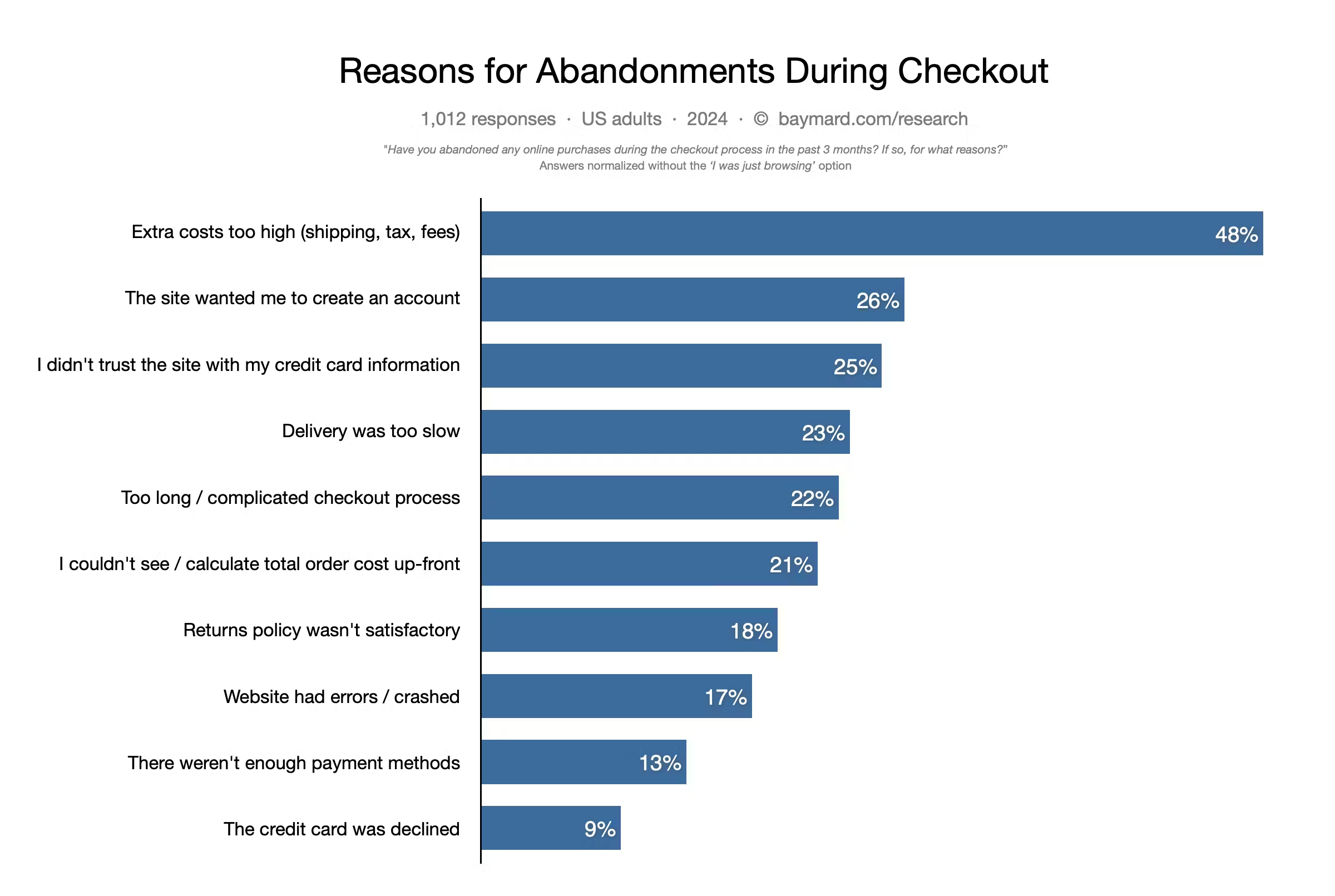
Before enabling customers to make purchases, several websites need them to register for an account. According to data from the Baymard Institute, the second most common reason why users give up on their carts is the request to form an account.

One of the main causes of users leaving eCommerce websites is the absence of guest checkout. The work needed to register (enter email address or phone number, choose a password that complies with security guidelines, and then confirm an email address or phone number) may not be commensurate with the advantages that users will experience (particularly if it’s a one-time transaction). Also, not everybody is content to divulge their personal information.

How to fix this issue;

  1. Allow guests to check out. Allow users to check out as guests or create a new account at their discretion. Visitors are more likely to make additional purchases from you if they choose to use guest checkout and have a positive experience.
  2. Make the option to check out as a guest stand out. Don’t bury guest checkout in tiny, scarcely perceptible text links.


Too much data entry is needed.

Nobody enjoys filling out forms, and the more data you request from people, the less likely it is that they will comply. Additionally, if you request a lot of information that doesn’t seem related to the work, many consumers will question why they are needed.

How to fix this issue;

  1. Only inquire about necessities. Limit the amount of fields that users must complete to the absolute minimum. Recall that you may always follow up to get further details (e.g., after the user placed an order).
  2. Some fields can have smart defaults to reduce the amount of typing required from the user. For instance, you can use the visitor’s geolocation data to pre-fill the delivery address.


Unexpected fees

Individuals are extremely cautious when it comes to money. Users are therefore less inclined to commit to the purchase when they are not informed about the total amount they will be spending on the checkout page. One of the main causes of visitors abandoning the purchase process is hidden shipping expenses. For this reason, you should never conceal additional fees.

How to fix this issue, On the product page, display the item’s price including taxes and the shipping costs.


Not enlightening delivery choices

During checkout, customers frequently ask, “When will I receive my order?” eCommerce websites all too frequently use ambiguous delivery descriptions, like “Standard (Regular)” or “Express (Fast).” This description’s flaw is that it fails to address the user’s query.

How to fix this issue, Specify the anticipated delivery date since this information aids in the decision-making process for users. Give a specific delivery date if possible, but if you are unable to do so, at the very least state that “Average delivery time is 5 business days.”


Multichannel encounter

Many website designers neglect to consider other aspects of the user journey in favor of concentrating only on the local experience. All facets of interacting with a product or service are included in user experience (UX), and it is crucial to offer a positive user experience at every stage of the user journey. Consider an eCommerce software that offers a seamless user experience for product purchases, but when buyers need to return an item, they get appalling customer care (i.e., lengthy wait times or a lot of paperwork). Even with an excellent product purchase flow, this part of the journey might negatively impact the user’s entire experience with the product.

How to fix this issue, Make an investment in fostering user relationships.


The significance of UX

Numerous advantages exist for your business and your consumers when you invest in the user experience of your e-commerce website. A well-optimized user experience (UX) for your store makes you stand out from the competition and boosts efficiency, conversion, and return on investment (ROI). To find out how, let’s take a closer look at each of these advantages.

Distinguishes your company

Online competition is fierce, as everyone knows, and it will only grow worse with the daily influx of new e-commerce websites. Because they have so many options, today’s online shoppers are inclined to shop around before deciding where to spend their money. This implies that in order to attract customers, you’ll need to do more than just have excellent products or great design—you’ll also need to provide an unmatched online buying experience.When your company is focused on giving your clients a unique shopping experience, your whole business strategy will have that comprehensive, long-term view that will set it apart from the competition.


Boosts customer satisfaction & loyalty

With so many shutdowns due to pandemics, online shopping is growing in popularity as a way to decompress. Your customer will buy from you with a smile rather than annoyance if you can satisfy their needs in a way that is entertaining and engaging.

Your e-commerce website offers all the benefits of the internet by default, including speed, efficiency, and convenience—all of which are characteristics that customers want in their buying experiences. Good UX is therefore essential. By making your website easy to use, you can lower barriers that prevent people from making purchases and increase the goodwill associated with your e-commerce business. Additionally, happy customers become more loyal to your business, increasing revenue and reducing the need to recruit new clients.


Generates productivity and efficiency

Good user experience generally makes your company more flexible. Customers will be able to browse and purchase things faster when your online store is simple to use. This implies that they can enter and exit as fast as feasible.

Consider it this way: tasks require less time the faster they are completed. You are able to accomplish more in less time. Similar to this, you increase the likelihood that more purchases will be made in a given day when you make it simple and quick to make purchases.

Raises return on investment and conversion rates

Effective user experience (UX) pays off in large part because it facilitates customers’ ability to search for, access, and buy products from an e-commerce website. You can convert more surfers into purchasers when your online store makes it simple for customers to search and purchase things. Additionally, as was already mentioned, consumers that develop a strong brand loyalty will frequently come back and purchase additional merchandise from you, increasing your profits.

Naturally, at some time you’ll also want to improve your online store. If you spend money on SEO or bespoke design, bad user experience (UX) may counteract or even completely erase these gains. Your site’s user experience must be optimized to maximize the return on investment and prevent distractions from these expenditures.


Conclusion

Making sure that the style, design, content, branding, sound, and interaction of e-commerce websites are as user-friendly as possible can have a significant positive impact on their user experience (UX). Online retailers and their clients gain a lot of advantages that benefit both the company and the buyer since their products are useful, valuable, flexible, and appealing.

If you are looking for high quality web or app development services feel free to drop us a message
The Future of UI/UX: How Designers Can Use Technology to Create Next-Level Experiences

The Future of UI/UX: How Designers Can Use Technology to Create Next-Level Experiences’


‘Hey there, design enthusiasts! Today, we’re diving into the exciting world of UI/UX and how designers can harness the power of technology to create next-level experiences. With the rapid advancements in tech like AR, VR, and AI, the possibilities for mind-blowing user experiences are endless. So, let’s strap in and explore how these cutting-edge technologies shape the future of UI/UX design.

Advancement Augmented Reality (AR), Virtual Reality (VR), and Artificial Intelegence in UI/UX Technologies

First off, let’s talk about augmented reality (AR). This game-changing technology allows designers to overlay digital elements in the real world, creating immersive and interactive experiences. Imagine walking through a museum and using your smartphone to see additional information and interactive displays superimposed onto the exhibits. AR can also be used in e-commerce to allow customers to try on clothing or accessories before purchasing. It’s a whole new level of engagement that brings the digital and physical worlds together seamlessly.

Next up, we have virtual reality (VR), which takes users on a completely immersive journey into a digital environment. Designers can use VR to create lifelike simulations for training, education, and entertainment. For example, imagine being able to explore a virtual campus before deciding on a college or taking a virtual tour of a hotel before booking a room. The possibilities for creating unforgettable experiences are endless with VR technology.

Now, let’s talk about artificial intelligence (AI) and its impact on UI/UX design. AI can personalize user experiences by analyzing user behavior and preferences. For instance, AI-powered chatbots can provide tailored recommendations and support to users based on their interactions. AI can also automate repetitive tasks, allowing designers to focus on more creative and strategic aspects of their work.

But AR, VR, and AI are just the tip of the iceberg when creating next-level experiences. There are plenty of other emerging technologies that designers can harness to push the boundaries of UI/UX. Here are eight more examples:

Internet of Things (IoT)

Designers can create seamless experiences by integrating smart devices and sensors into their interfaces. For instance, a smart home app could use IoT to allow users to control their lights, thermostats, and security systems from a single interface.

 Motion and gesture control

By incorporating motion and gesture control, designers can create more intuitive and interactive experiences. Think of a fitness app with motion control to track and analyze user movements during workouts.

3D and spatial design

With the rise of 3D technology, designers can create more immersive and visually stunning interfaces. For example, an interior design app could use 3D and spatial design to allow users to visualize and customize their spaces in real time.

Biometric authentication

Designers can enhance security and convenience by integrating biometric authentication methods such as fingerprint and facial recognition into their interfaces. This could be used in a banking app to provide a more secure and seamless login process.

Wearable technology

By designing interfaces for wearable devices like smartwatches and fitness trackers, designers can create experiences seamlessly integrate into users’ daily lives. For instance, a health and fitness app could provide real-time feedback and guidance on a smartwatch during a workout.

Haptic feedback

By incorporating haptic feedback, designers can create interfaces that provide tactile sensations, enhancing the overall user experience. Imagine a gaming app that uses haptic feedback to simulate the feeling of recoil when firing a virtual weapon.

Immersive audio

With advancements in audio technology, designers can create interfaces that provide immersive and spatial audio experiences. For example, a music streaming app could use immersive audio to make users feel at a live concert.

Blockchain technology

Designers can leverage blockchain technology to create more secure and transparent interfaces, particularly in industries like finance and healthcare. A healthcare app could use blockchain to store and share patients’ medical records securely.

As you can see, the future of UI/UX is inspiring, with a wide range of technologies at designers’ disposal to create next-level experiences. By staying abreast of these emerging technologies and thinking outside the box, designers can continue to push the boundaries of what’s possible in the world of user interfaces and experiences. So, let’s embrace the future and prepare to create some genuinely mind-blowing designs!

If you are looking for high quality web or app development services feel free to drop us a message